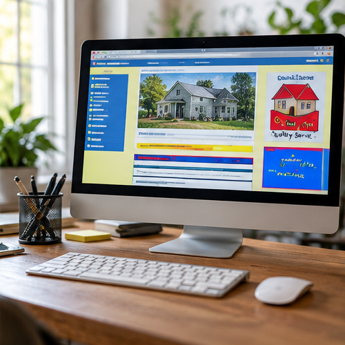
Professional does not have to mean complicated
A small business website can be simple and still look professional. Problems usually appear when the site feels inconsistent, confusing, inaccurate or unfinished.
Some issues are visual. Others affect trust because they make it harder for a visitor to understand the business or complete a basic action.
Inconsistent fonts, spacing and colors
Using many unrelated font styles, inconsistent button designs or noticeably different spacing from section to section can make pages feel pieced together. Consistency helps visitors understand which elements belong together and which actions are important.
Low-quality, stretched or poorly cropped images
Images do not need to be expensive professional photography in every case, but they should display cleanly and be appropriate for the business. Stretching a small image, using the wrong proportions or cropping out the important part of a photo can hurt the presentation.
Outdated or contradictory information
A polished design cannot compensate for an old phone number, discontinued service, incorrect location or conflicting business hours. Accuracy is part of professionalism.
Visual polish is only one part of a professional website. A simple site with accurate information and clear navigation can serve customers better than an elaborate site that is difficult to use.
Too much content competing for attention
Large blocks of text, too many buttons, repeated calls to action and crowded sections can make it difficult to tell what matters. Good organization gives important information enough space to be understood.
Confusing navigation
Visitors should not need to decode a menu. Clear page names and predictable navigation make it easier to find services, business information and contact options.
Broken links and unfinished sections
Buttons that lead nowhere, missing images, placeholder text and pages marked “coming soon” long after launch can make a site feel unattended. A small number of these issues may be straightforward to correct.
A poor mobile experience
A page can look polished on a large monitor and still feel unprofessional on a phone if content overlaps, text is difficult to read or important buttons are hard to use. See common reasons a website looks bad on a phone.
Weak or unclear calls to action
A visitor should be able to tell how to take the next reasonable step. The exact action depends on the business, but contact, estimate, booking or purchasing paths should be understandable and should work.
Does an unprofessional-looking website need a redesign?
Not automatically. If the site's structure and content are fundamentally sound, a limited number of visual, navigation or mobile corrections may improve it substantially. If problems run throughout the site, larger changes may be more appropriate.
If your existing website basically works but needs targeted cleanup, see my Website Makeover service. You can also review how to tell whether your business website is outdated.