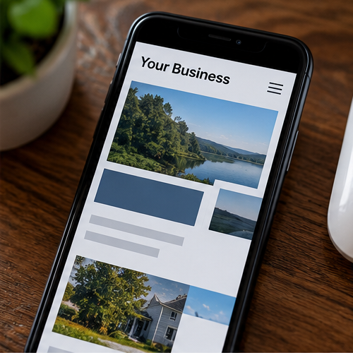
A desktop website does not automatically work well on a phone
Modern website platforms and responsive code can adapt layouts to different screen sizes, but that does not mean every page will look or work well automatically. Content choices, custom styling, image dimensions and older layouts can still create mobile problems.
1. The layout is too wide for the screen
Content that extends beyond the screen can force visitors to scroll sideways or can hide part of a section. Fixed-width elements, oversized media and older layouts are common reasons this happens.
2. Text is too small or too crowded
Visitors should not have to zoom in just to read normal page content. Very small text, long lines, tight spacing and large blocks of copy can all make a mobile page harder to read.
3. Buttons and links are difficult to use
Buttons that are tiny, too close together or partially covered by another element can be frustrating on a touchscreen. Important actions such as calling, requesting a quote or opening a contact form should also be easy to find.
Mobile-friendly does not mean every device will display a page identically. Screen sizes vary. The goal is a layout that remains readable, usable and understandable across common screen sizes.
4. Images are causing layout problems
An image can look good on a desktop and still crop awkwardly, become too tall or push important content far down a phone screen. Oversized image files can also contribute to slower loading, although actual performance depends on several factors.
5. Desktop sections stack poorly
Columns that sit side by side on a large screen usually need to stack on smaller screens. If that order is not planned carefully, a heading can become separated from its text, an image can appear in an odd location or the page can become unnecessarily long.
6. The navigation is difficult to understand
A desktop menu often changes into a mobile menu. If important pages are buried, labels are unclear or the menu itself does not work correctly, visitors may struggle to move through the site.
7. Custom code or older styling may be interfering
Custom CSS, third-party widgets and older site code can affect responsive layouts. The exact cause has to be checked on the individual site rather than assumed from appearance alone.
Does a bad mobile layout mean I need a new website?
No. A few spacing, image, navigation or layout issues may be fixable without replacing the website. If problems occur throughout the site or are caused by fundamental limitations in the existing setup, larger changes may be needed.
A Website Makeover is intended for existing sites that basically work but need targeted improvements. You can also review the signs that a business website may be outdated.